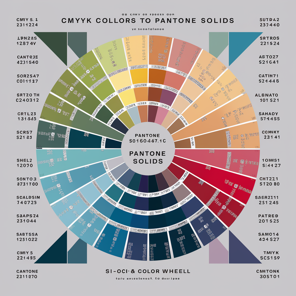
CMYK Colors to Pantone Solids Finding the closest match between CMYK and Pantone solid colors can be tricky. Designers often need to convert CMYK colors to Pantone to ensure consistent printing results. Understanding how to match these color systems helps maintain brand consistency and achieve the desired visual impact.
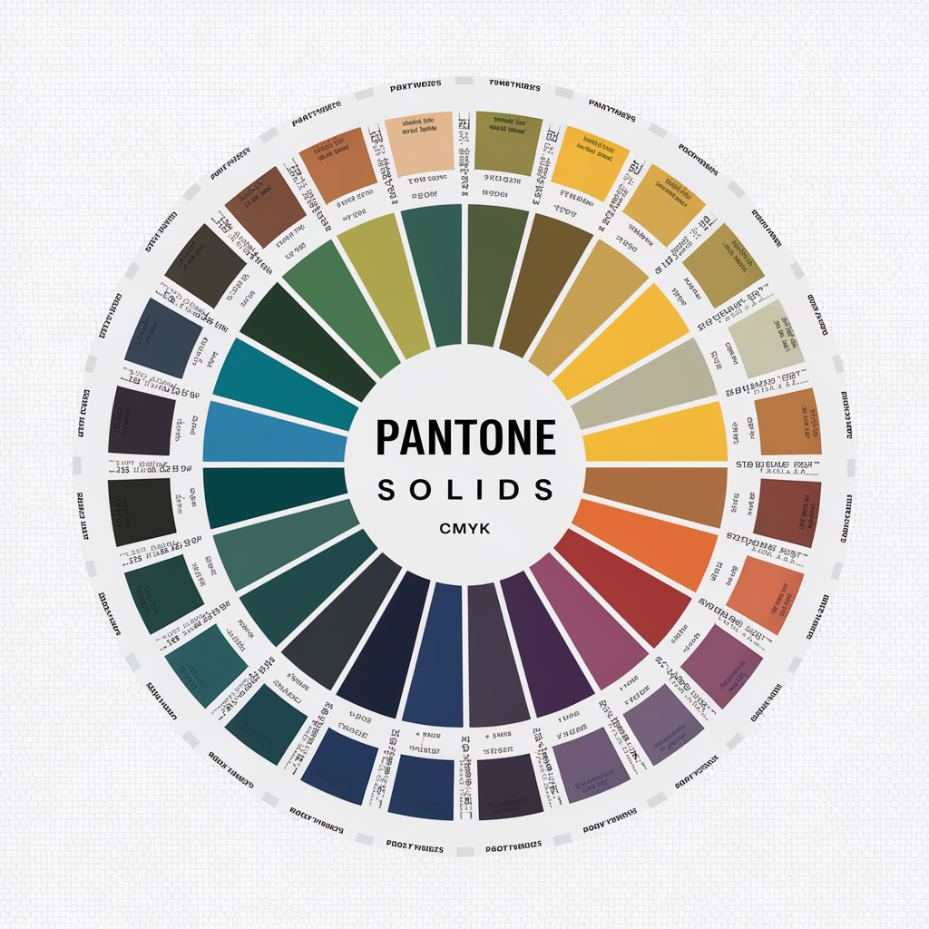
Understanding CMYK and Pantone Color Systems
CMYK is a color system that uses four inks: cyan, magenta, yellow, and black. It is commonly used for digital printers. Pantone, on the other hand, is a standardized color system with a unique formula for each shade.
Pantone colors are more consistent because they are premixed inks. CMYK, however, depends on a printer’s settings and paper type, which can cause slight variations. Designers often need to convert CMYK colors to Pantone to make sure the print colors look the same everywhere.
Matching these systems is not always perfect. That’s why using tools or software is helpful to get the closest match.
Why Matching CMYK to Pantone Matters
Matching CMYK to Pantone is important because it ensures consistent branding. Imagine printing a logo where the colors look different in each batch. It would ruin your brand’s identity!
Pantone colors also help achieve vibrant shades that CMYK might struggle with. Many companies require Pantone colors for important designs like logos, banners, or product packaging.
Using the closest match between CMYK and Pantone solid colors also saves time. It prevents endless adjustments and reprints. With the right method, you can confidently send your files to print.
How to Find the Closest Match Between CMYK and Pantone Solid
To find the closest match, you can use tools like Adobe Illustrator or online converters. These tools let you input your CMYK values and suggest the nearest Pantone color.
Here are some tips for accurate matching:
Check your CMYK values carefully before converting.
Use Pantone Color Bridge guides for physical reference.
Adjust colors slightly if needed to get the desired match.
Always remember, the closest match might not be exact. Use small prints to test your design and ensure that the colors work well.
Common Challenges in CMYK to Pantone Conversion
Finding the closest match CMYK and Pantone solid colors can be tricky. Here are some common issues designers face:
1. Colors Look Different on Screen and Print
Screens use RGB colors, which are brighter than CMYK or Pantone.
Always proof your design on paper before finalizing.
2. No Exact Match Available
Some colors, especially bright or neon shades, don’t exist in both systems.
In such cases, pick the closest match or adjust your design slightly.
3. Limited Tools or Guides
Not all tools provide accurate matches.
Invest in updated software and Pantone books for better results.
These challenges can be solved with practice and the right tools.
Tips for Maintaining Color Accuracy Between CMYK and Pantone
Getting a perfect match between CMYK and Pantone solid colors may not always be possible, but you can ensure better accuracy by following these tips:
Understand Your Project Needs:
Decide whether your project requires CMYK or Pantone colors.
Use Pantone for branding or special printing and CMYK for regular printing.
Work with Professional Tools:
Use Adobe Illustrator or Photoshop for accurate conversions.
Keep your Pantone Color Bridge updated for precise matches.
Test Print Your Designs:
Print a small sample to see how colors look in real life.
Adjust colors if the print doesn’t meet your expectations.
Collaborate with Your Printer:
Share your color requirements with your printer.
Ask for suggestions on achieving the best results based on their equipment.
Conclusion
Finding the closest match between CMYK and Pantone solid colors is important for good design and printing results. Pantone ensures that your colors stay the same on every material, while CMYK is best for digital printing.
With tools and proper testing, you can easily match these two systems. Always double-check your colors and make sure they meet your expectations. Whether you’re creating a logo, flyer, or product label, knowing how to match CMYK and Pantone will make your work look professional.
FAQs
Q: Why do CMYK and Pantone colors look different
A: CMYK is a mix of inks, while Pantone uses premixed solid colors, making them more consistent.
Q: Can I match all CMYK colors to Pantone
A: No, some CMYK shades don’t have an exact Pantone match. You can only find the closest match.
Q: What is the best tool for CMYK to Pantone matching
A: Adobe Illustrator and Pantone Color Manager are great tools for accurate matches.
Q: Is Pantone better than CMYK
A: Pantone is better for exact color matching, while CMYK is ideal for printing flexibility.
Q: Do I need a Pantone guide to match colors
A: Having a physical Pantone guide ensures accurate matching and is highly recommended.